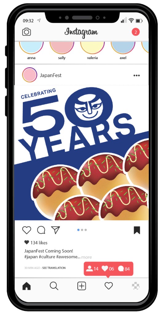
JapanFest
JapanFest's rebranding project introduces a unified visual identity that aligns with the festival's brand voice, bringing consistency and clarity to how the festival is presented.
- Client
JapanFest Atlanta is an annual celebration of Japanese culture, bringing together local communities, enthusiasts, and visitors to explore Japan's rich traditions and contemporary aspects.
- Problem
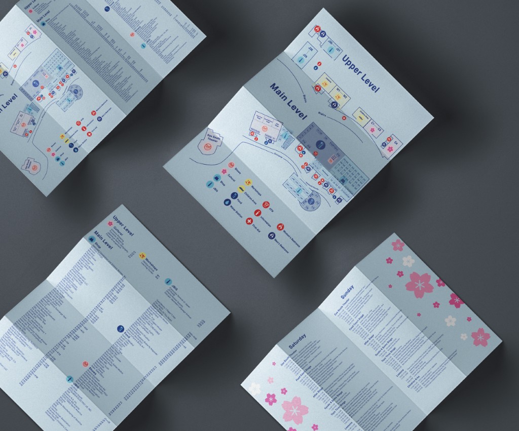
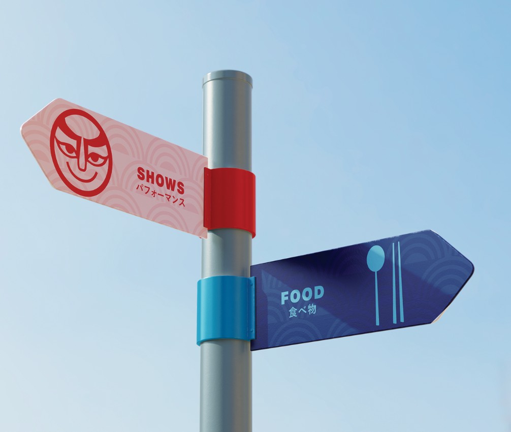
- JapanFest's physical and digital presence lacked visual cohesion, and wayfinding plus user flow felt unclear across touchpoints.
- Solution
- A unified identity system and brandbook were developed to improve consistency, clarity, and overall festival communication.
Research & Process
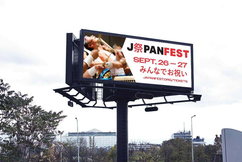
I researched JapanFest through firsthand experience and an online audit, revealing a lack of cohesion across physical and digital platforms. Both wayfinding and user flow were unclear and disjointed.
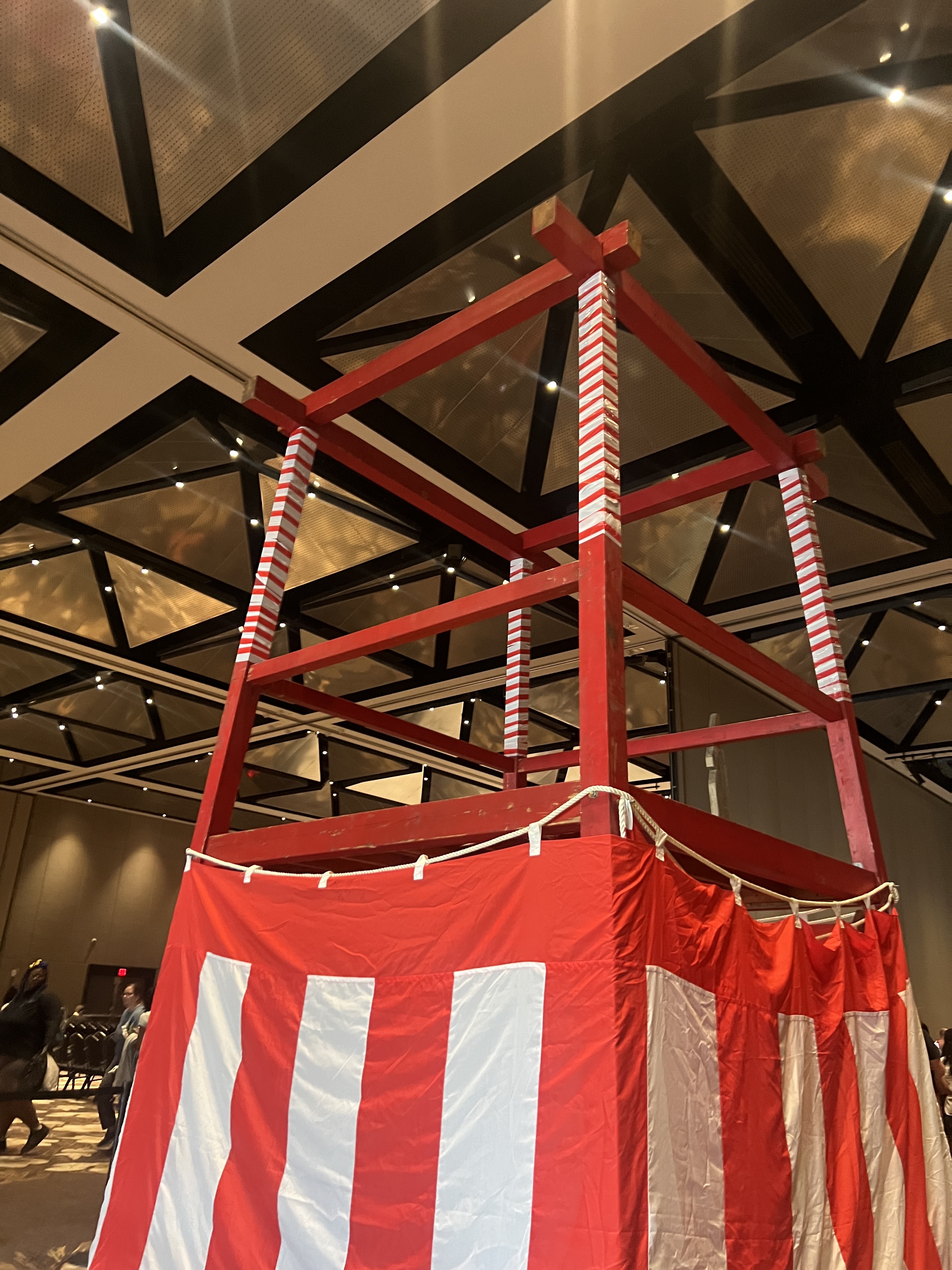
Yagura, a traditional Japanese raised platform typically used during festivals 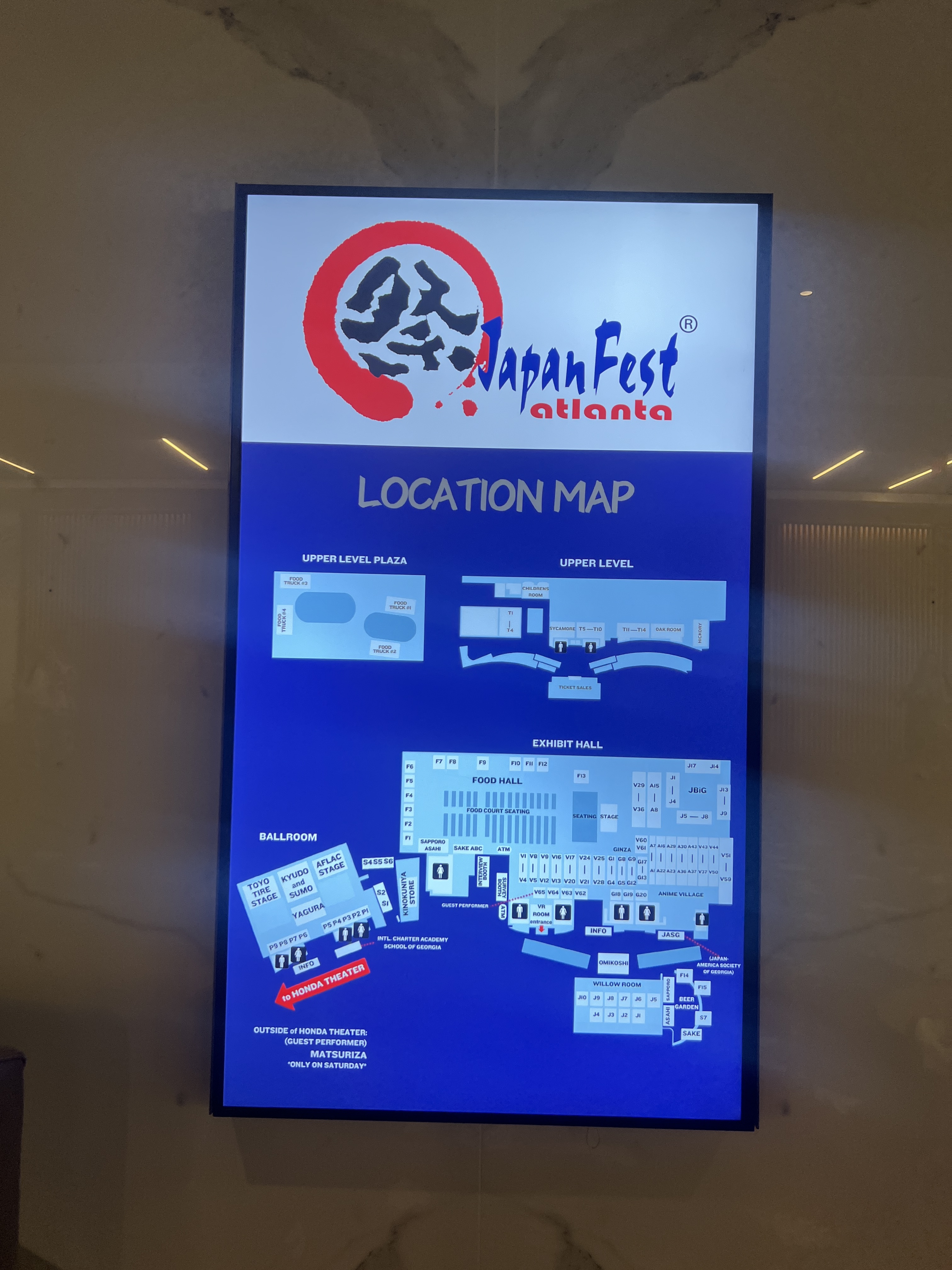
Current map at the festival 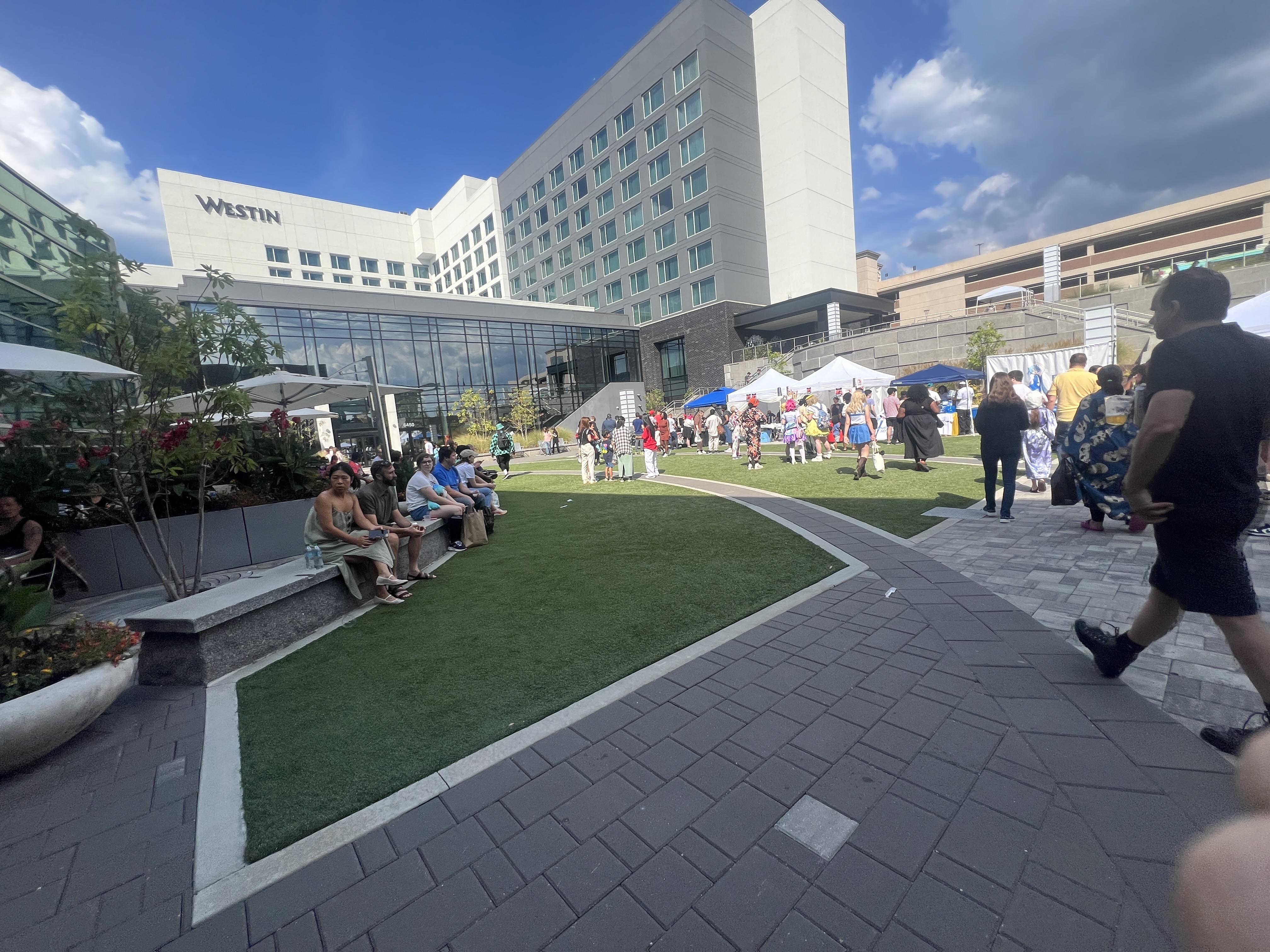
Outside venue 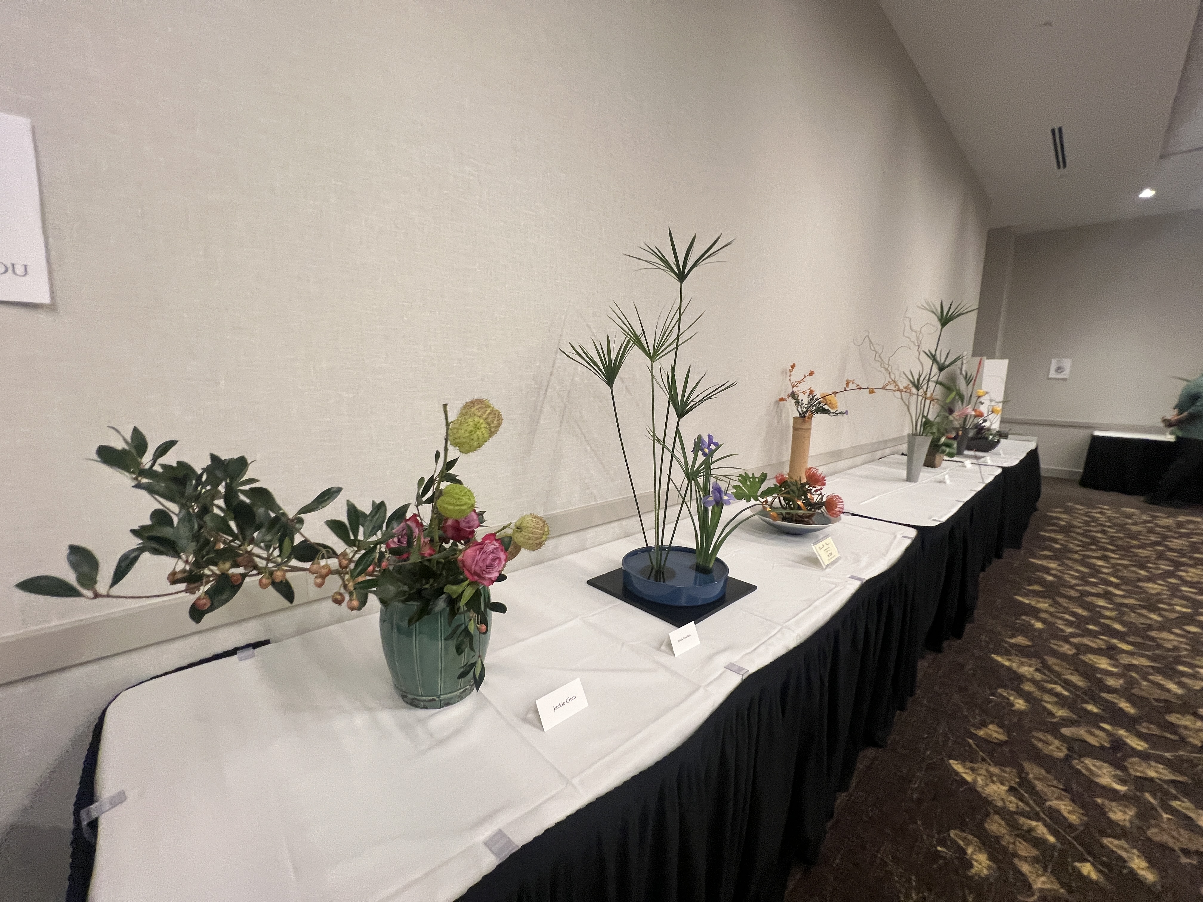
Ikebana is the Japanese art of flower arrangement
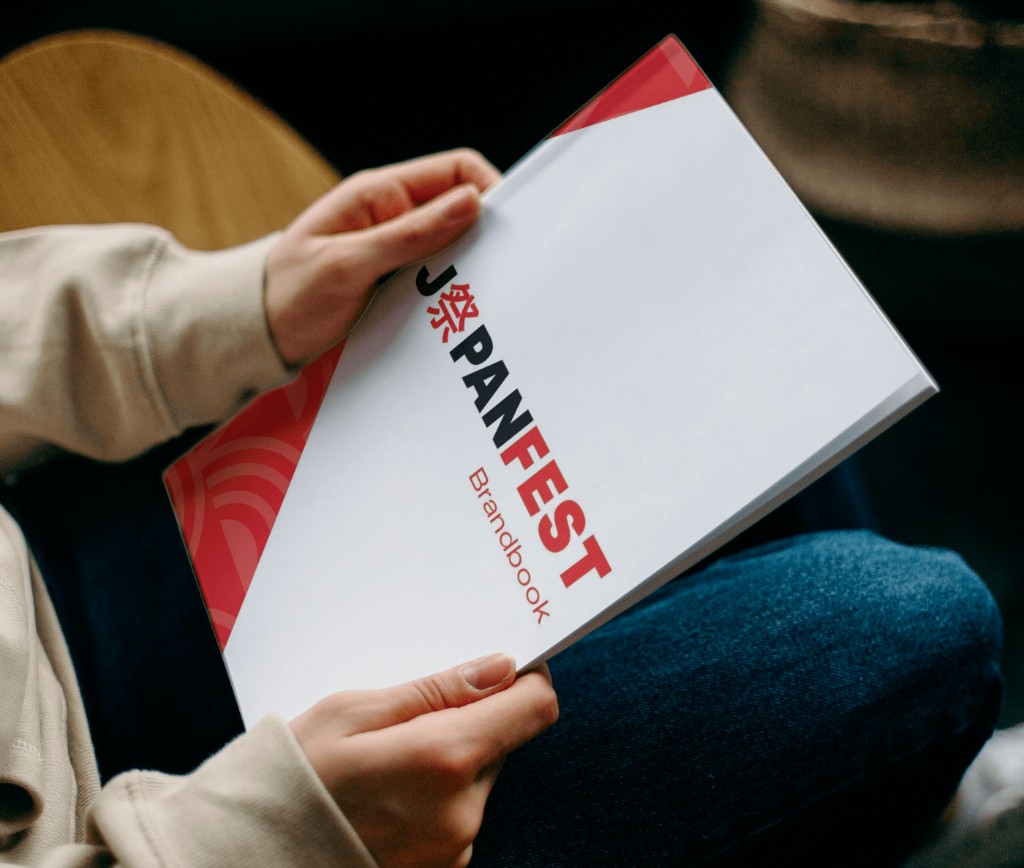
Through research, I designed a brandbook that reflects their personality and voice.
Color Palette
The colors complement the vibrant and dynamic atmosphere of the festival while adding a sense of modernity. Our palette draws inspiration from past graphics and the prominent hues seen throughout the festival.
- Festive Red#e73232
- Mt. Fuji Blue#263b80
- Sakura Pink#efa1bf
- Vibrant Blue#32bae5
Typography
The primary typographic family is Aktiv Grotesk, which is easy to read and has several styles and weights. There may also be a mix with Owners XWide family for sub-headers and the Japanese font family.
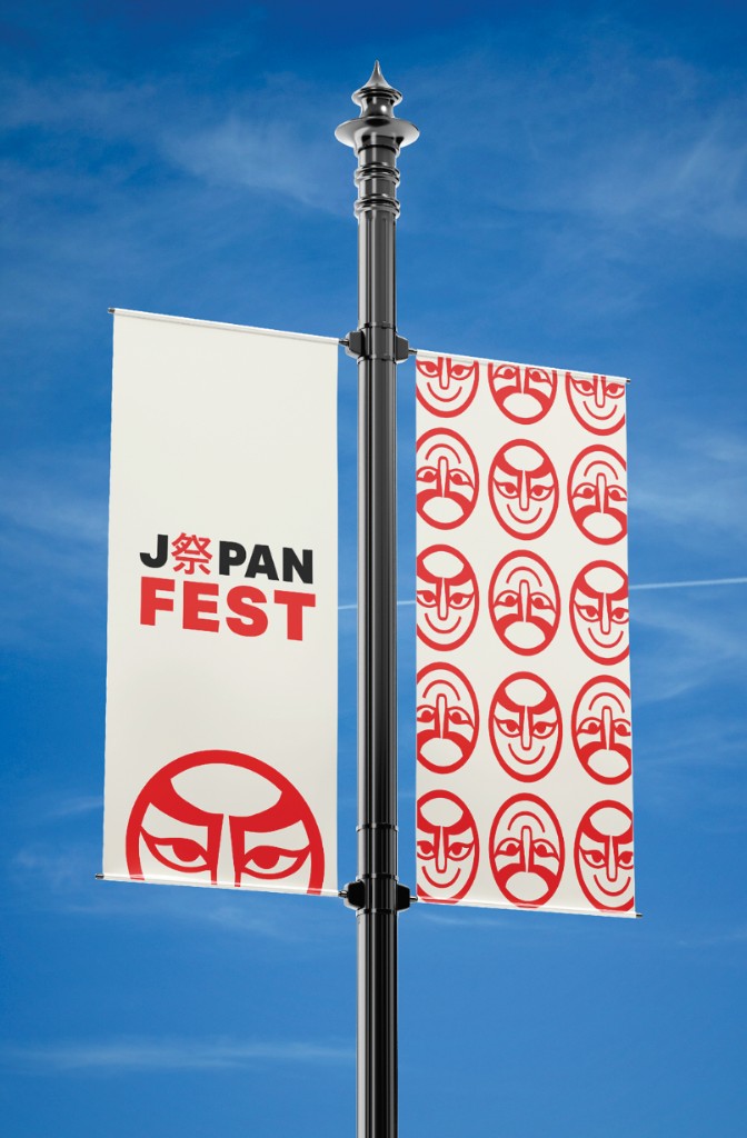
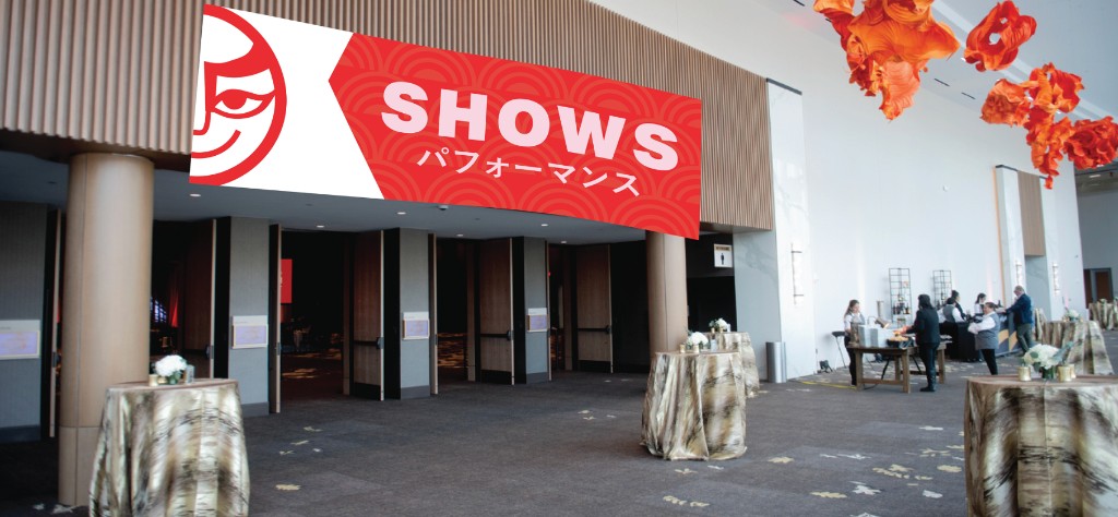
Mascot / Icon
The mascot icon draws inspiration from Japan’s iconic Kabuki masks and reflects the look of the masked performers at the festival.